
From New York to Los Angeles, businesses across America are losing customers because their websites fail on mobile. Here is how to stop the bleed.
Picture this: a potential customer in Houston finds your website on Google. They are ready to buy. They tap the link on their phone and the text is tiny, the buttons are impossible to tap, and half the page is cut off. In under five seconds, they hit the back button and give their money to your competitor.
That scenario plays out millions of times every single day across the United States. And most business owners have no idea it is happening to them.
If your website is not built with responsive web development best practices, you are not just losing visitors. You are actively pushing paying customers straight into your competitors arms.
This guide explains what responsive website development services really are, why they matter more than ever in 2026, and what to look for when choosing the right partner to build or redesign your website.
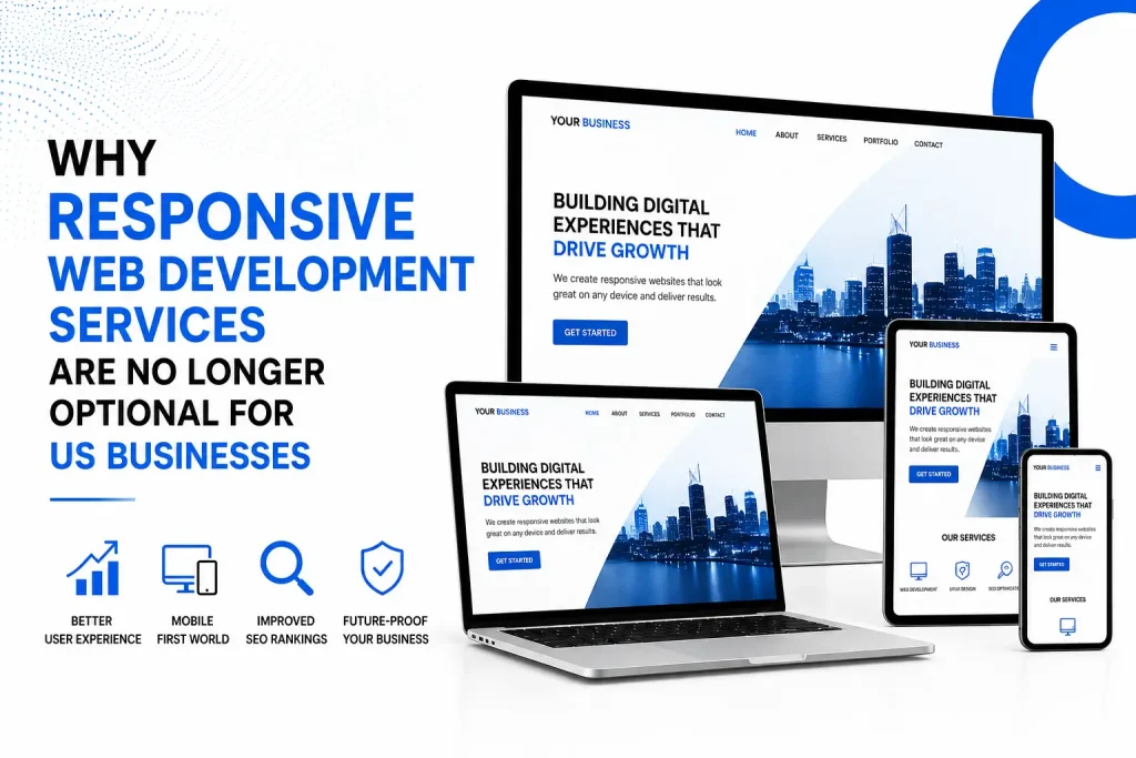
What Is Responsive Web Development, Really?
Responsive web development is the practice of building websites that automatically adjust and look great on any screen size, whether a visitor is on a 27-inch desktop monitor, a 10-inch tablet, or a 4-inch smartphone.
It uses a combination of:
- Fluid grid layouts that scale content proportionally
- CSS media queries that apply different styles for different screen sizes
- Flexible images and media that resize without losing quality
- Touch-friendly navigation built for thumbs, not just mouse clicks
In short, a responsive website is one single codebase that shapes itself to the user’s device. No separate mobile site. Zero compromises. Just a seamless experience wherever your audience finds you.
Build Faster, Grow Smarter – Start With Enorness!
Let’s shape the future of your business. Connect with Enorness today for smart, scalable digital solutions!
Let’s TalkThe Numbers That Should Keep Every Business Owner Up at Night
Still not convinced this matters for your business? Let the data do the talking.
- 63% of all US web traffic now comes from mobile devices (Statista, 2024)
- 57% of users say they will not recommend a business with a poorly designed mobile site (Google)
- 88% of online consumers are less likely to return to a site after a bad experience
- 74% of users are more likely to return to a site that works well on mobile
- Google now uses mobile-first indexing, which means your mobile site is your SEO ranking
The math is simple. A non-responsive website is not just an inconvenience. It is a revenue leak. Every broken layout is a lost conversion. Every frustrated mobile visitor is a customer choosing your competitor.
Who Actually Needs Responsive Web Development Services?
The honest answer is: every business with a website and an audience. But some industries feel the pain more acutely.
Small and Mid-Sized Businesses Across the USA
Whether you run a law firm in Chicago, a dental practice in Phoenix, or a boutique in Miami, your customers are searching for you on their phones first. A clunky mobile experience tells them, without a word, that your business is not modern or professional.
E-Commerce and Online Retailers
Cart abandonment spikes dramatically when the checkout experience is broken on mobile. Responsive web development for e-commerce is not optional. It directly determines whether people complete purchases or walk away.
Service Providers and Lead-Generation Businesses
If your revenue depends on contact form submissions, quote requests, or phone calls from your website, you cannot afford a broken mobile experience. Every form that does not load properly is a lead you paid to attract but failed to capture.
Startups and Growing Brands
First impressions are everything when you are building brand credibility. Responsive web development services give startups in cities like Austin, Seattle, and Denver the professional digital presence needed to compete with established players.
What Good Responsive Web Development Services Actually Include
Not all responsive web development is created equal. When evaluating any agency or development partner, here is what should be non-negotiable.
Mobile-First Development Philosophy
The best developers build for mobile screens first and then scale up to desktop, not the other way around. This aligns with how Google indexes your site and how your users actually browse.
Cross-Device and Cross-Browser Testing
Your website should function flawlessly on Chrome, Safari, Firefox, and Edge, on iPhones, Android phones, tablets, and laptops. Thorough testing is what separates a great delivery from a frustrating one.
Fast Load Times
Responsive design means nothing if your site takes six seconds to load on a 4G connection. Look for services that include performance optimization, compressed images, minified code, and CDN integration.
Touch-Optimized UI and UX
Buttons need to be the right size. Navigation must work with a thumb, not just a mouse. A great responsive web development company designs every element with the end user’s interaction in mind.
SEO-Friendly Architecture
A properly coded responsive website with clean HTML, semantic markup, and correct meta-viewport tags contributes positively to your Google rankings. Poor responsive implementation can actually hurt your SEO.
Scalable and Maintainable Code
Your business will grow. Your website needs to grow with it. Professional responsive web development services deliver clean, well-documented code that is easy to update, expand, and hand off.
Common Mistakes Businesses Make When Choosing a Web Development Partner
Over the years, patterns emerge in what goes wrong for businesses that end up with websites that do not perform. Watch out for these warning signs:
- Choosing based on price alone, only to pay more for fixes later
- Working with developers who deliver a visually appealing desktop site that completely breaks on mobile
- Getting a template website sold as custom with no real responsive architecture underneath
- Ignoring page speed as part of the responsive development scope
- Receiving a site with no post-launch support or documentation
- Hiring teams who do not understand your industry, audience, or business goals.
The right responsive web development partner is not just a vendor. They are a strategic investment in your business growth.
What to Look for in a Responsive Web Development Company in the USA
With hundreds of web development agencies operating across cities like New York, Los Angeles, Chicago, Houston, and beyond, how do you choose the right one?
Look for a team that:
- Has a verified portfolio of responsive websites across multiple industries
- Demonstrates a clear mobile-first development process
- Offers ongoing support, not just a one-time delivery
- Understands conversion rate optimization alongside design
- Communicates in plain language and keeps you involved throughout the process
- Has experience with related services like lead generation, custom software, and mobile apps so your digital ecosystem works together.
Enorness, our web development services team works with businesses across the United States, from startups in Austin to established companies in New York, to deliver responsive, high-performance websites built for real-world results. Every project begins with understanding your audience, your goals, and what makes your business unique.
Beyond responsive web development, Enorness offers a complete digital growth ecosystem including;
3. Custom software development
so you never have to piece together multiple vendors to achieve your goals.
Build Faster, Grow Smarter – Start With Enorness!
Let’s shape the future of your business. Connect with Enorness today for smart, scalable digital solutions!
Let’s TalkResponsive Web Design and SEO: A Connection You Cannot Ignore
Google’s mobile-first indexing means Google predominantly uses the mobile version of your content for indexing and ranking. In plain terms: if your mobile site is broken, incomplete, or slow, your Google rankings suffer, no matter how good your desktop site looks.
A professionally built responsive website:
- Sends positive user engagement signals to Google through lower bounce rate and longer sessions
- Loads faster, which is a direct ranking factor since Google’s Page Experience update
- Avoids the duplicate content issues that used to plague separate mobile sites
- Makes it easier to earn backlinks because the same URL works across all devices
When you invest in quality responsive website designing services, you are also investing in stronger SEO outcomes, not as a side benefit, but as a core function of how modern search works.
Real-World Impact: What Changes When Your Website Goes Responsive
Consider a mid-sized accounting firm based in Dallas, Texas. Their website was built in 2018, professional-looking on desktop, but painful to use on mobile. Their Google Analytics showed a 78% mobile bounce rate. Contact form submissions from mobile were nearly zero.
After a full responsive rebuild with mobile-first architecture, performance optimization, and touch-friendly navigation:
- Mobile bounce rate dropped from 78% to 34%
- Contact form submissions from mobile increased by 210%
- Average session duration on mobile increased by 1 minute 42 seconds
- Organic search rankings improved for 18 competitive keywords within 90 days
This kind of transformation is not unusual. It is the expected result when responsive web development is done right.
Questions to Ask Any Web Development Company Before You Hire Them
Before signing any contract or starting any project, use these questions to evaluate whether a web development partner is the right fit:
- Can you show me examples of responsive websites you have built that perform well on mobile?
- How do you handle cross-browser and cross-device testing?
- What does your performance optimization process look like?
- Do you offer post-launch support and maintenance?
- How do you approach mobile-first design versus desktop-first?
- What tools do you use to measure page speed and Core Web Vitals?
- Can you explain your approach to SEO-friendly responsive development?
A qualified, experienced development team will have clear, confident answers to every single one of these questions. Vague answers are a red flag.
Your Next Step: Stop Losing Business to a Broken Website
Every day your website is not fully responsive, you are paying a hidden tax in lost leads, lower Google rankings, and customers who leave and never come back.
The good news? This is a solvable problem. With the right responsive web development services, your website becomes your hardest-working sales tool, available 24 hours a day, on every device, in every city across the United States.
Whether you are in New York, Los Angeles, Chicago, Houston, Phoenix, or anywhere else across the country, the opportunity to turn your website into a genuine growth asset is right in front of you.
Get Your Free Responsive Website Development Services Consultation
Frequently Ask Questions
Q1: What are responsive web development services?
A: Responsive web development services involve designing and building websites that automatically adjust their layout, content, and functionality to display correctly on any screen size including desktops, tablets, and smartphones. A responsive website uses fluid grids, flexible images, and CSS media queries to deliver a consistent, optimized experience across all devices.
Q2: Why does my business in the USA need a responsive website?
A: Over 63% of US web traffic comes from mobile devices. Google uses mobile-first indexing, meaning your mobile site determines your search rankings. A non-responsive website leads to high bounce rates, lost leads, and lower Google rankings. Businesses across the USA, from New York to Los Angeles, need responsive websites to remain competitive and capture mobile-driven revenue.
Q3: How much do responsive web development services cost in the USA?
A: The cost varies based on project scope, complexity, and the development partner. A professional responsive website for a small to mid-sized US business typically ranges from $3,000 to $25,000 or more. Factors that affect cost include the number of pages, custom features, e-commerce functionality, and ongoing maintenance requirements. Request a free quote from a reputable agency for an accurate estimate.
Q4: How is responsive web design different from adaptive web design?
A: Responsive web design uses fluid, percentage-based layouts that adjust to any screen size using a single codebase. Adaptive web design uses multiple fixed layout sizes that trigger based on the device detected. Responsive design is generally preferred today because it provides a smoother experience across the full range of devices and is easier to maintain long-term.
Q5: Will a responsive website improve my Google rankings?
A: Yes. Google’s mobile-first indexing means your mobile site directly impacts your search rankings. A properly built responsive website improves Core Web Vitals scores including loading speed, interactivity, and visual stability. It also reduces bounce rate, increases session duration, and eliminates duplicate content issues, all of which contribute positively to your overall SEO performance.